Set Overlap Visualization
Some people think I work for the evil people on the internet - we provide paywall technology. The market is now much more sophisticated and our platform allows creation of all kinds of experiences depending on where the user comes from, their devices, adblock usage as well as on-site behavior (i.e. has read more than 5 articles in the sport section). What we call an experience can mean showing a popup, asking a user to register or change the css style for overlays based on the segment they fall into.
A user may be subject to multiple experiences at different times and this might be quite difficult to visualize sensibly. In addition, when enacting new rules, you don’t want the segments to overlap too much as it might result in annoying the visitors with too many messages. This brings me to the reason I am writing this post. While sometimes you can build a prediction model to solve all our challenges with personalized approach, that’s not always possible (especially in cases with no historical data) so you would have to conduct a simple analysis. I have recently been tasked with figuring out the best way to visualize set overlaps and building a few prototypes in R. It was an interesting exercise and I would like to share my learnings and opinions.
The data
I will be using a dummy dataset. Let’s keep things easy and consider a dataset of clicks (pageviews). We will have two (2) experiences:
- Experience One for clicks from users with adblock on (let’s say we display a pop up asking them to turn it off) for when they visit the recipe section
- Experience Two set up for visitors to an opinion section regardless of their adblock preference. In our sample data, each experience will affect 10% of clicks.
This means a click can fall into one of three categories – Experience One, Experience Two and No Experience occurring with a ratio of 1:1:8.
The next flag we will be assigning is the use of adblock. Let’s say 20% of all clicks will be with adblocking software being active. Since Experience One only targets users on recipes, all clicks with Experience One (10% of all clicks) will have a true flag for AdblockOn while the remaining 10% of adblock clicks will be divided randomly between Experience Two and No Experience. The clicks that are left will have a “true” for AdblockOff flag.
Lastly we would like consider clicks coming from social media, let their frequency be 20% and we distribute them randomly (having a true flag for SourceSocial) with the remaining clicks being assigned a SourceOther flag. We generate 100,000 such clicks. All code used in this blogpost can be found on my github
The tools
I’ve already mentioned I’ve used R. During my search I have looked into three packages - VennDiagram, venneuler and UpSetR. In addition, I have tried to adapt corrplot package for this purpose. I will now go through each one of them illustrating use. I will list the pros and cons for all approaches, but I would like to say that I think every package is a job well done.
VennDiagram
We will start with the VennDiagram package. It allows you to draw plots with 1-5 sets which already implies it doesn’t scale beyond that. That might not be necessarily negative, since a chart with 6 sets may already be quite problematic to read. While you may be eager to draw your first plot (who wouldn’t /sarcasmoff), you need to pre-chew the data for the package. For input it requires you to specify the size of each set as well as the size of each overlap which means having a 2^(n-1) input parameters, where n denotes the number of sets to visualize.
As soon as you have all the combinations, you can start drawing. I have written a few functions for each number of sets that you might want to visualize.
Two sets
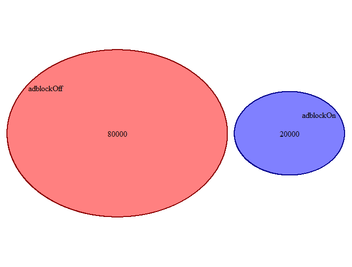
The two set visualization seems very flexible and the set sizes scale / move around based on real ratios. The interpretation seems intuitive and the labels are easy to display.
Three sets
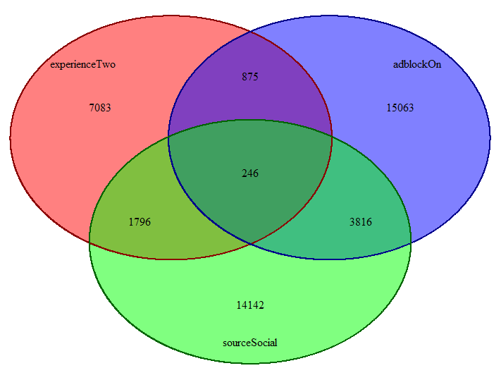
The second example already shows a bit of inconsistency. Both sets and their overlaps are disproportionate. The chart doesn’t reflect this though. The chart becomes more symbolic and less realistic.
Five sets
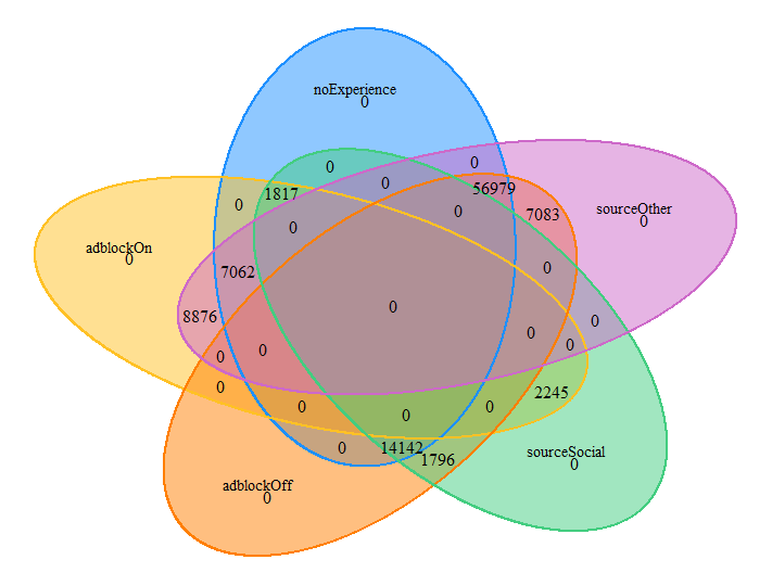
Visualizing the overlaps of five sets continues the trend of symbolic representation.
Thoughts
The VennDiagram package is reliable in the way that you know what to expect. Even if your five sets overlap in strange ways, you get the same chart. This is however also a negative because the charts become more and more symbolic. I’ve already mentioned it doesn’t scale beyond five sets.
venneuler
The venneuler package is much easier to start with as it calculates the combinations on its own. You also don’t need to specify the number of sets to visualize. Therefore, I won’t divide this chapter based on the number of sets visualized. Let’s move on to the charts
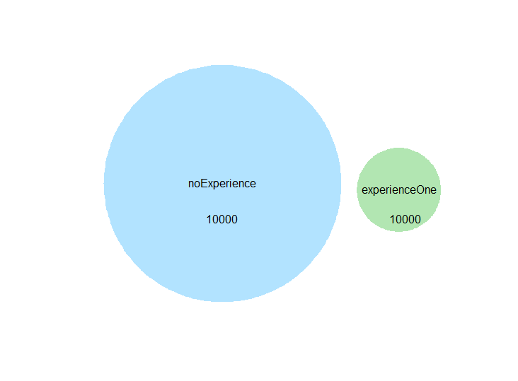
The first chart looks nice and clean except for the fact that we need to supply and place the set count text boxes ourselves. This is easy for smaller numbers of sets, but scaling this approach seems unnecessarily complex considering the author(s) of this package have already cracked relative object placement for the visuals.
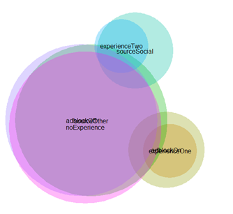
Attempting to visualize all 7 sets at once. It seems like the package handles the set spacing very well, but the label issue remains.
Thoughts
The venneuler package does a very good job of spacing and scaling the sets within the chart, but it fails to do the same for labels (which is really a shame). Turning off the labels and replacing them with a color legend doesn’t solve the issue.
corrplot
corrplot offers some really cool plots for correlation matrices, so my first idea was whether we could use this for visualizing set overlaps. The first obvious downside is the fact that a correlation is between a pair of variables, which means looking into overlaps between more than two sets can be taxing. My first instinct was to simply visualize the correlations between the flags in the dataset. Please note we only visualize positive correlations since an overlap should be the positive part, negative correlations are replaced with 0s.
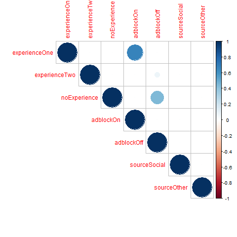
If you are realizing something is gravely wrong here, you’re right. We’ve seen quite a few overlaps between the sets, but correlations don’t seem to show any of it. There are two reasons - since we are interested only in overlaps and our flags usually have 10-20% of positive examples, most of our correlations are made up of zero values. One very simple solution is to calculate the percentage overlaps between the flags and reshape them into a correlation matrix.
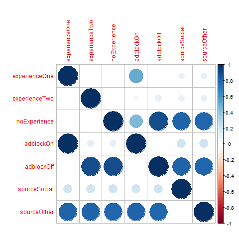
The first thing you may notice is that the plot is no longer diagonally symmetrical. This is because while 100% of pageviews with ExperienceOne are ones with AdblockOn, not all AdblockOn pageviews are in ExperienceOne. This makes this chart hard to read. We wouldn’t want a business user to deal with this headache.
I have already mentioned we are interested only in overlaps, so why not adjust the way we calculate correlations. The idea is to calculate an overlap correlation only for observations where either of the flags have a one. The reason for this is the following:
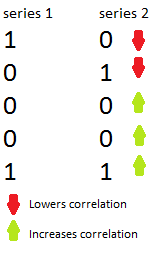
Where the correct translation for the purpose of overlaps should be
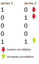
This is quite a simple adjustment that can be done via the code published on github. Please note we adjust the values to positive, since we care about the overlaps rather than the disagreements. While this may seem counterintuitive, I have tried to break the measure over and over and it seems to work reasonably well. I am happy if someone can suggest a case where it doesn’t work as intended. This results in the following chart
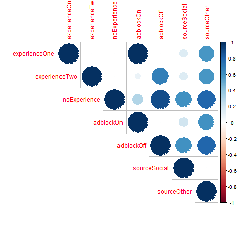
which works quite well as long as you keep in mind that it the overlap correlation is a simplified measure and averages the two-way effect of P(A|B)/P(B)!=P(A|B)/P(A) as mentioned previously when discussing the overlap shares.
Thoughts
I think that the overlap correlation approach is an interesting concept, but it still has the huge disadvantage of being only pairwise which means taking into account more than two sets can be difficult to read in the chart. Holy grail of set visualization still eludes us.
UpSetR
It is hard to write this paragraph without revealing the punchline, but since you’ve come this far, I’ll just say it - UpSetR is great. It includes this combo-type chart, that uses simple concepts to visualize set overlaps. It also can work with raw data. So let’s take a look, shall we?
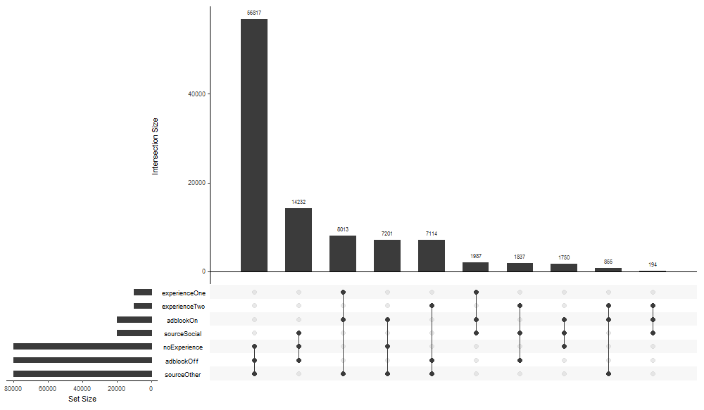
Let’s zoom in on the individual parts of the chart
Barchart for each frequency combination
The barchart is quite intuitive, it starts with the most frequent combinations and trails off
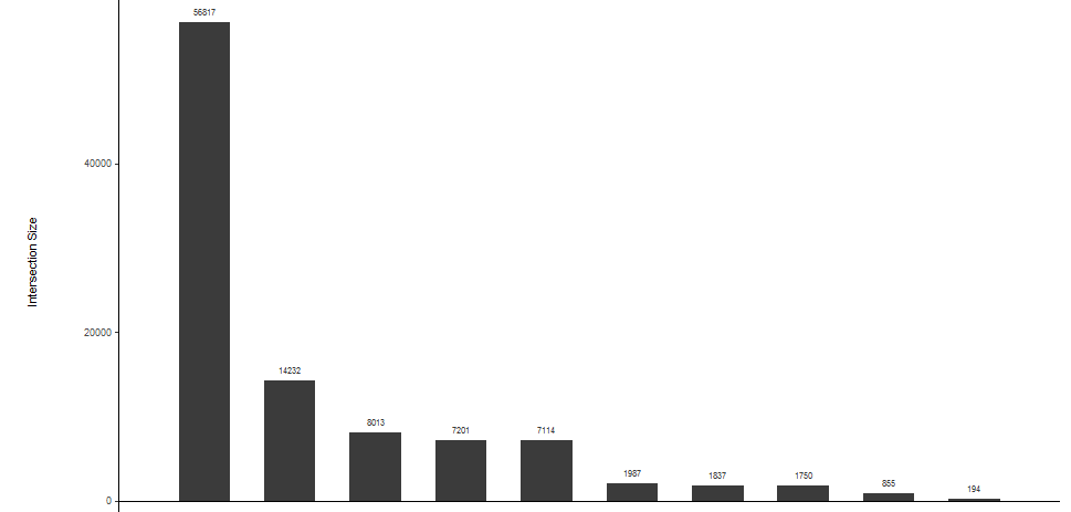
Barchart itself is pretty basic, but there is an important element that provides context:
Legend
The legend provides an intuitive display of sets each combination includes

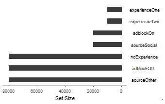
Last part of the UpSetR puzzle is a frequency for each set displayed left of the Legend
Set frequencies
Set frequencies tie to the legend (frequency is always a bar left to the set name on the legend)
Thoughts
While UpSet elegantly takes care of some scaling issues, as with any data visualization there is surely a point where it becomes undreadable due to too may sets being displayed. Despite this UpSet very efficiently provides key information about set overlaps - set frequencies, overlap frequencies and an intuitive display of which sets each combination spans.
Summary
All of the three packages have their pros and cons. While there is one I consider more useful, all of them provide different approaches when it comes to the trade-off between intuitive understanding, and accurate data representation.
Do you know any other worthwhile package for the job? Do you think overlap correlation is a sham? Was any of this useful? Let me know. All of the code can be found on my github[link].
Sources:
Venn Diagram Package Tutorials on rstudio-pubs
